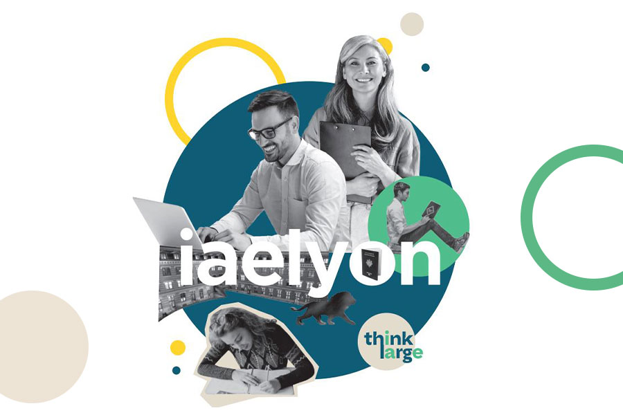
A new visual identity for iaelyon school of management

Following the brand perception study led for the 1st time in 2020, iaelyon, with the agency J’Articule, has undertaken a redesign of its communication tools. The objective is to ensure consistency of the school identity, supported by its signature “think large” with a more direct and simpler style and speech.

The first step of the process brought a modernization of the iaelyon logo. Refined shape, harmonized typography with University Jean Moulin’s and removal of the sidebar to give breathing spaces are the key element towards this evolution.
The brochure of the School has been redesigned to break barriers and be more adaptable to all market targets. Its structure puts “Think Large” at the heart of the brand and its strategy. Our main goal is to produce a more direct branding and to highlight the distinctive elements of our school in a competitive environment.
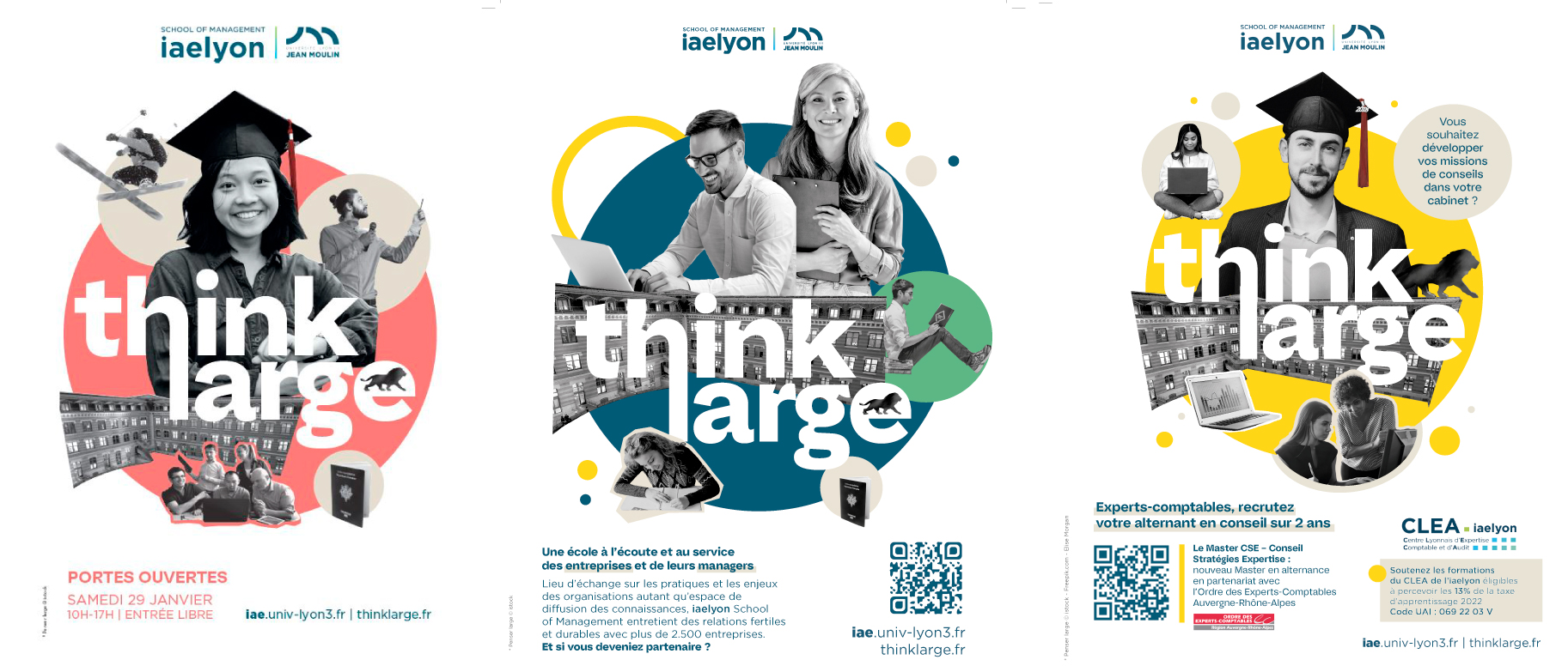
A new communication campaign starting in January
From the brochure cover page, the campaign uses collage, fresh color circles and invite us to discover the school’s fizzing by offering multiple variations adapted to our communication needs.

“With a simplified and sharpened speech, iaelyon affirms itself for what it is: a reference university-based school of management which honors its promise “Think Large” by challenging itself to always better answer its students’, partners’ and business’ needs”
Laurent Coppin, J’Articule
The new identity is a step in the branding strategy the iaelyon started in 2009 in order to promote its university-based school of management model and to increase its students’ sense of belonging
